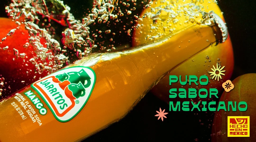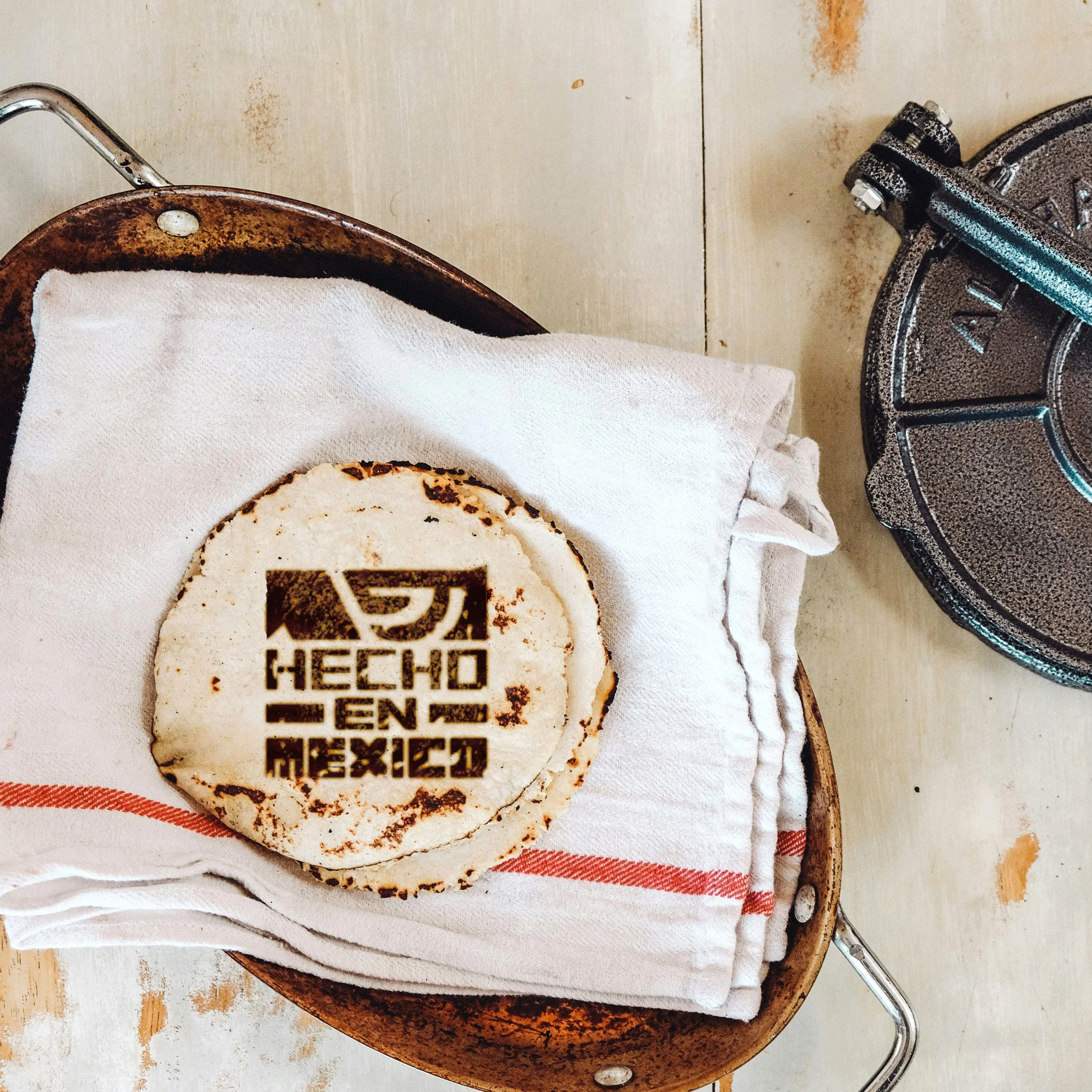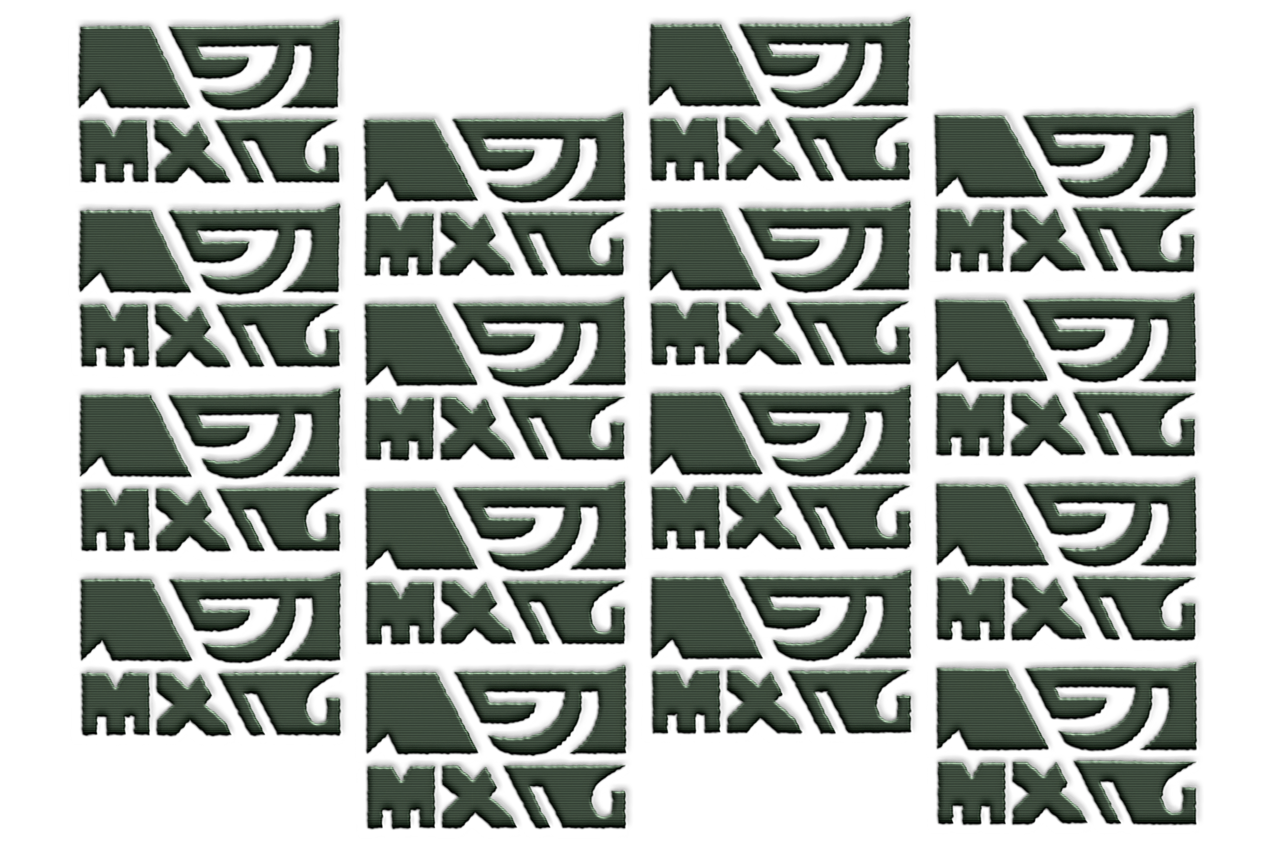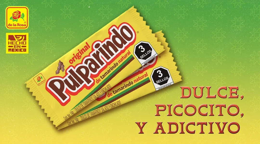
Hecho en MEXICO - Logotype & Branding
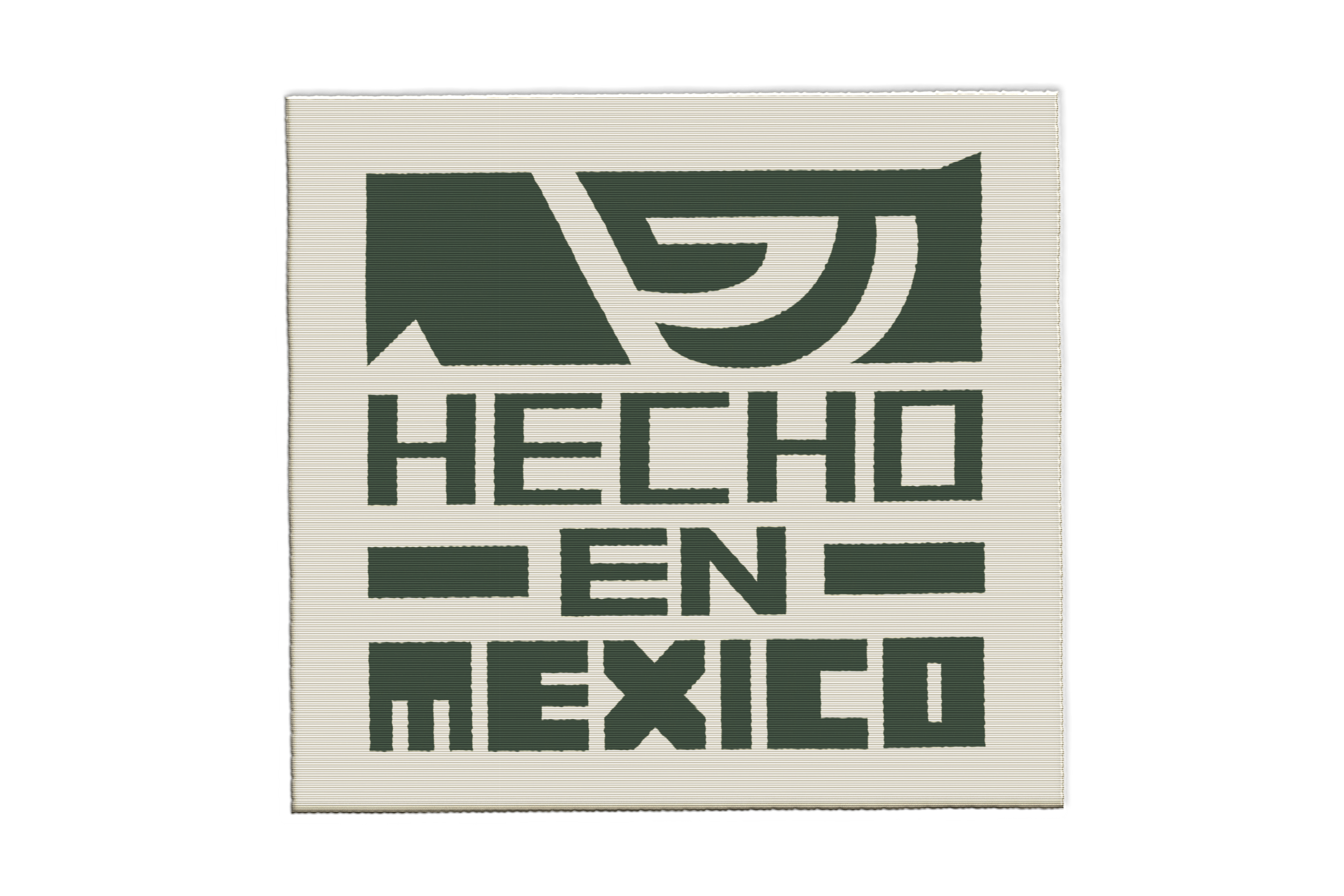
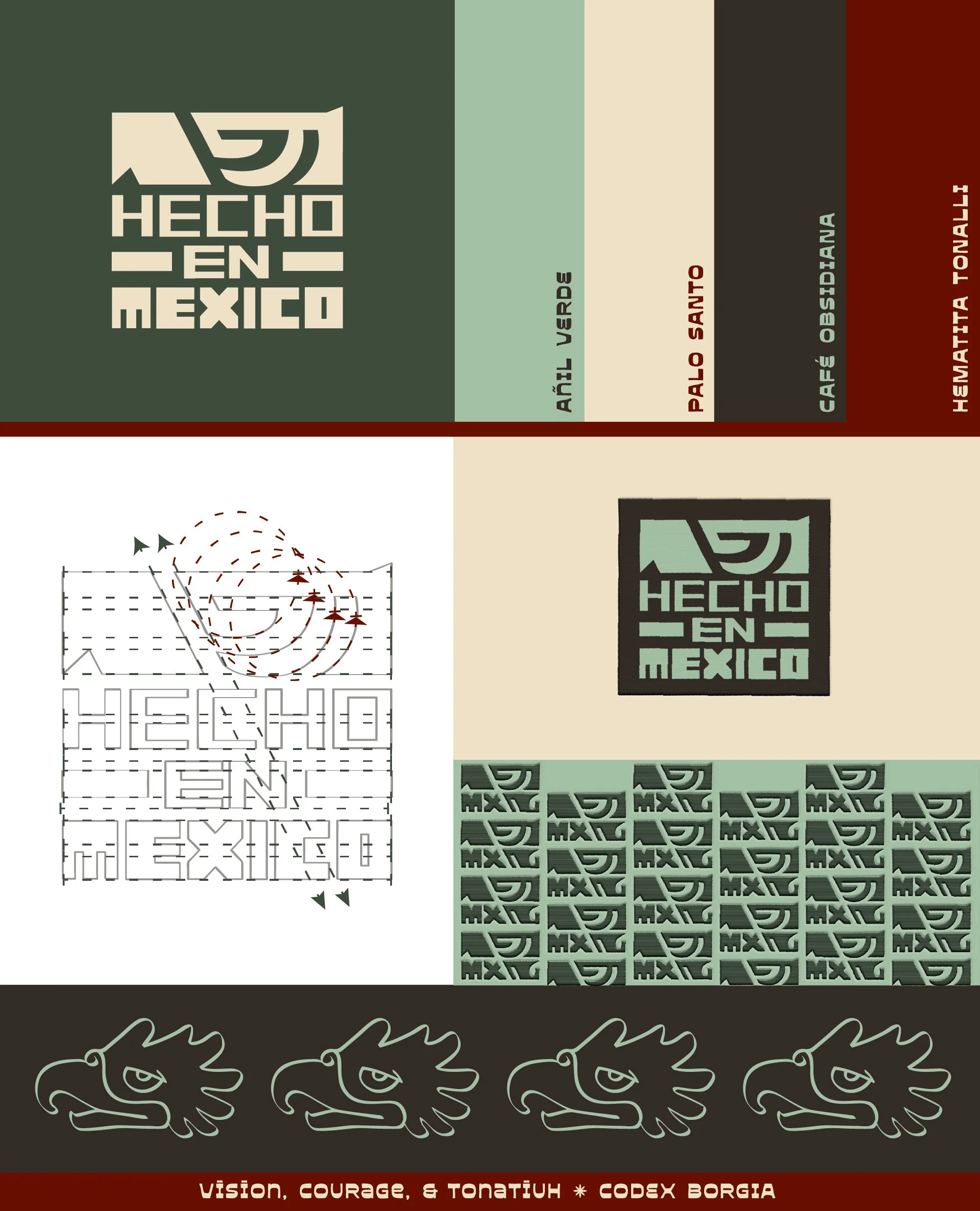
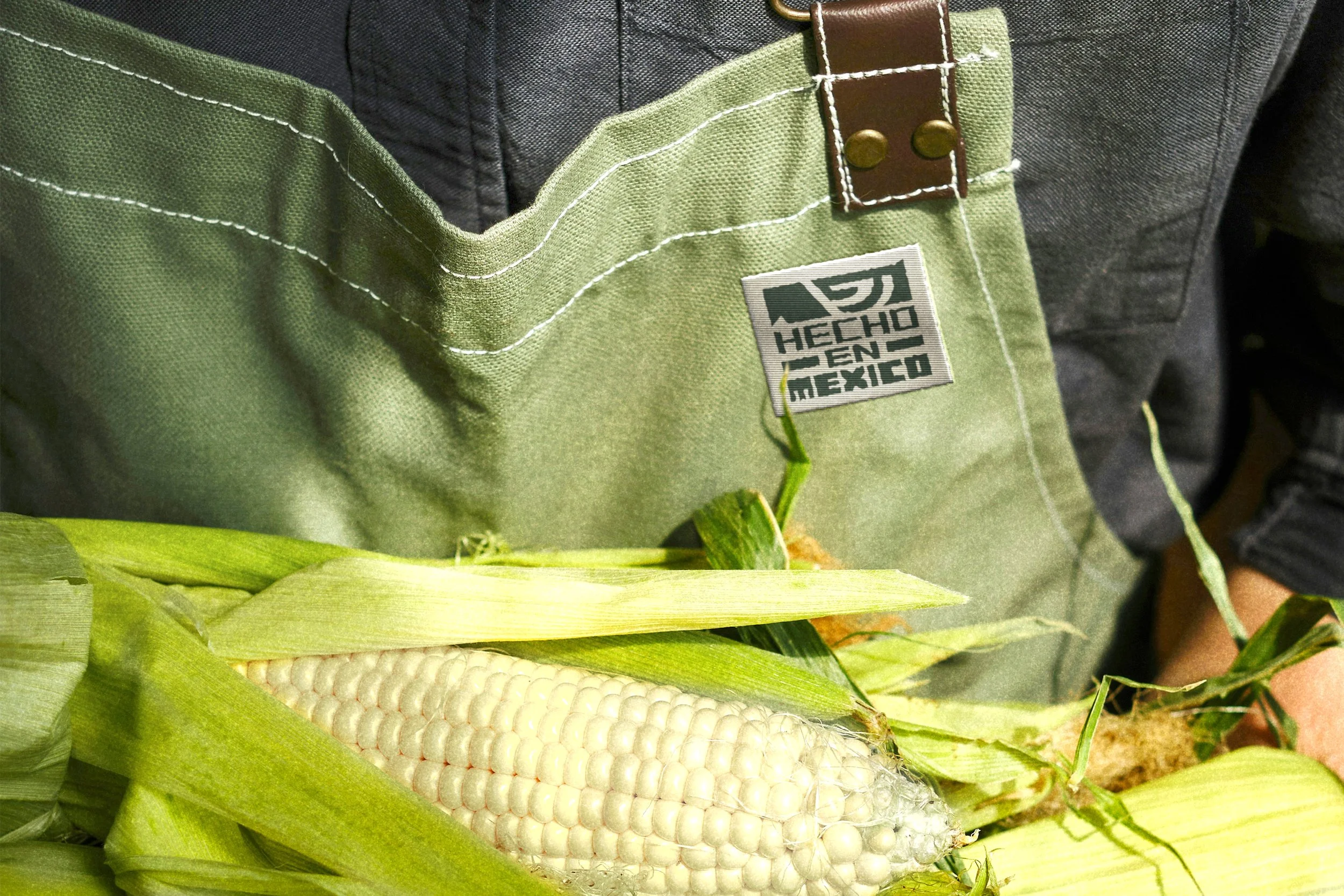
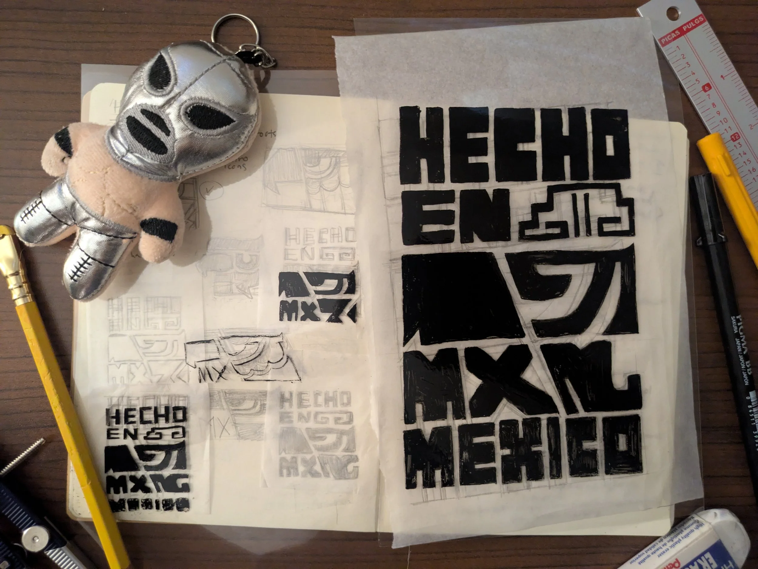
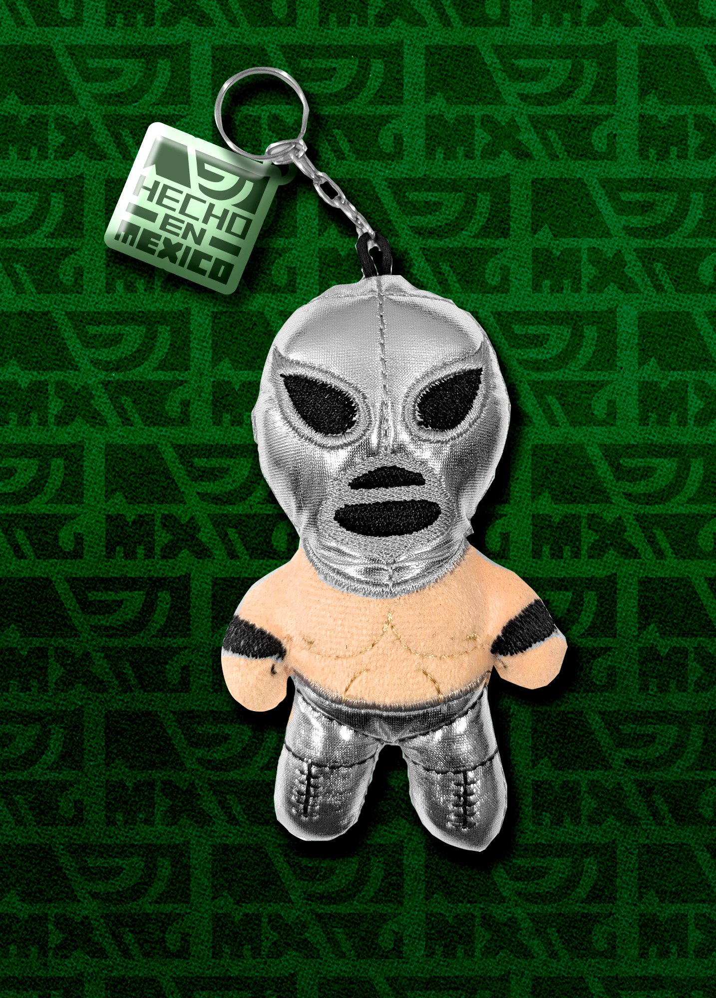
Everyone has seen the iconic “Hecho en MEXICO” logotype. The new version was made in 2025, I thought the design look to similar to the iconography to the CDMX Metro system. I wished it had that pre-Hispanic aesthetic from the Mexica civilization after all they were the ones to establish the city of Mexico-Tenochtitlan. So, I decided to take a stab at it since I wanted to play with some of my favorite Mexican products.
The iconography comes directly from the Mexica hieroglyphs (codex borgia) in many codices the word, “Cuauhtli” is depicted as an eagle head facing right or left. In Mexica cosmology, the eagle represented the Sun and the heavens. Alongside the jaguar (ocelotl), it gave its name to the elite Eagle Warriors (cuauhpilli) and ceremonial stone vessels (cuauhxicalli) used in rituals.
Proudly proclaiming “Hecho en MEXICO” with vision, courage and heart (tonatiuh).
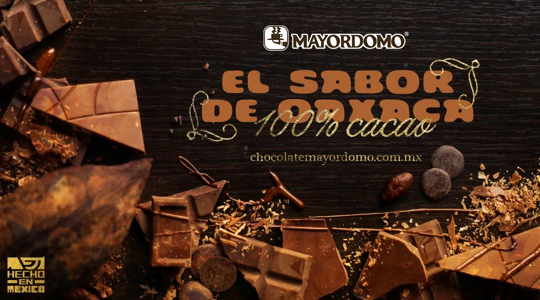
All ads, logotype and implementation were designed without the use of AI.